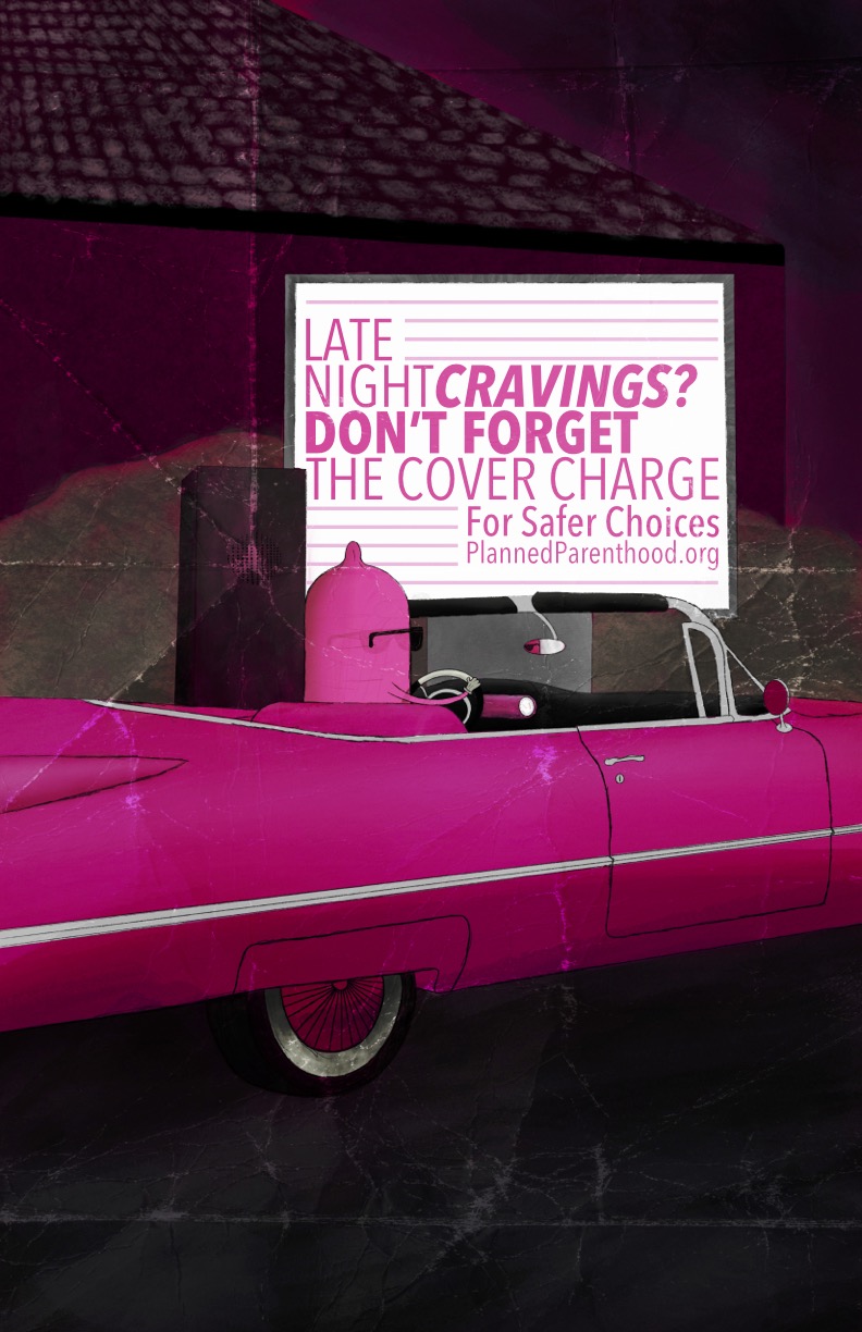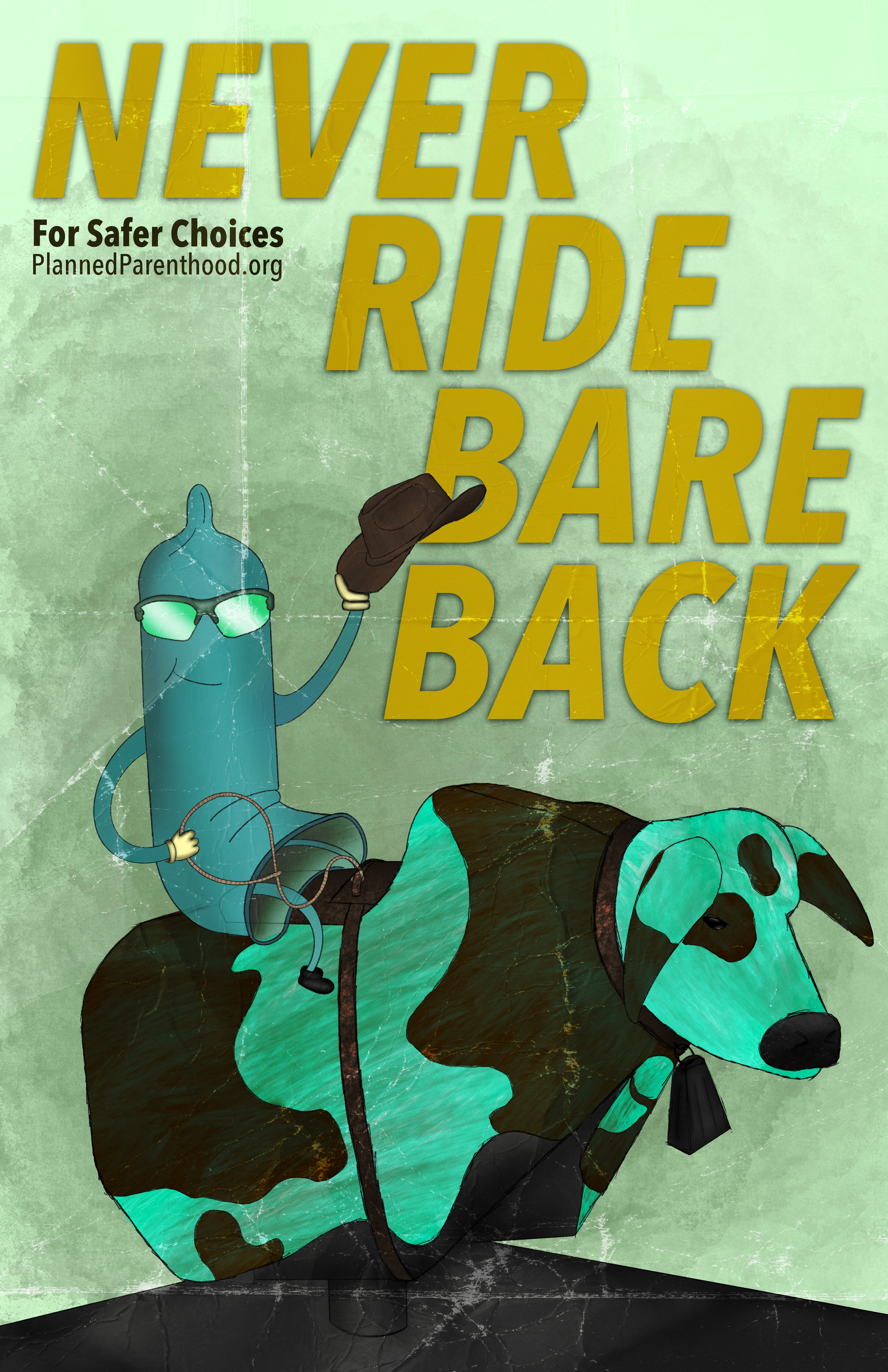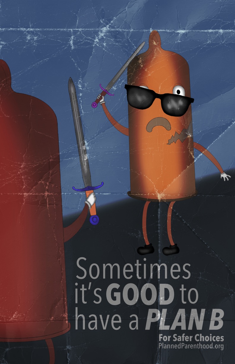
Safer Choices is an informative awareness campaign created in partnership with Planned Parenthood to promote safe sex and empower young adults to make responsible decisions. The goal of the series was to deliver memorable, accessible messaging through humor, character-driven visuals, and bold taglines that communicate the importance of protection and preparedness. Each poster uses playful scenarios and personified condoms to capture attention while reinforcing key messages about safer sexual practices.
Job Expectations / Goals & Objectives
The primary goal of this project was to create an engaging awareness campaign that communicates the importance of safe sex to college-aged individuals. The campaign needed to feel approachable, humorous, and visually memorable while still delivering clear educational messaging. The posters were expected to catch the attention of young adults who may overlook traditional health communication.
Objectives:
- Create a series of posters that use humor and visual storytelling to make safe-sex topics less intimidating.
- Develop relatable, character-driven imagery that connects with a younger audience.
- Communicate safe-sex practices clearly through bold taglines and symbolic scenarios.
- Maintain consistent branding and tone across all three posters for campaign cohesion.
- Ensure the messaging aligns with Planned Parenthood’s mission for safer choices and sexual health awareness.
Overall Expectation:
The campaign was expected to spark curiosity, start conversations, and encourage young adults to think about protection before making sexual decisions. The posters were designed to be eye-catching, easy to understand, and memorable enough that viewers would recall the message even after walking past them. The overall expectation was to create a series that feels fun and light-hearted while still emphasizing responsibility and safe decision-making.
Research
To build an effective campaign for younger college-aged individuals, the research focused on understanding how humor, relatability, and visual metaphor impact awareness messaging. Studies on public health communication show that younger audiences respond more positively to content that feels casual, nonjudgmental, and entertaining. Because traditional safe sex posters often feel clinical or unengaging, humor became a key strategy for capturing attention and making the message memorable.
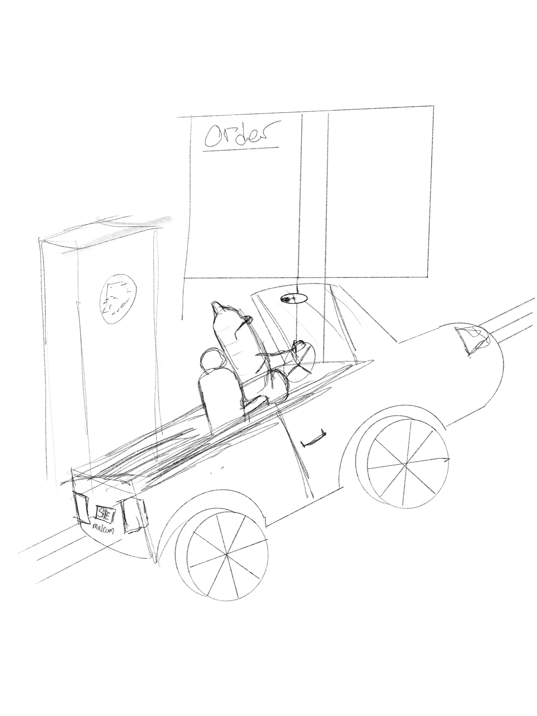
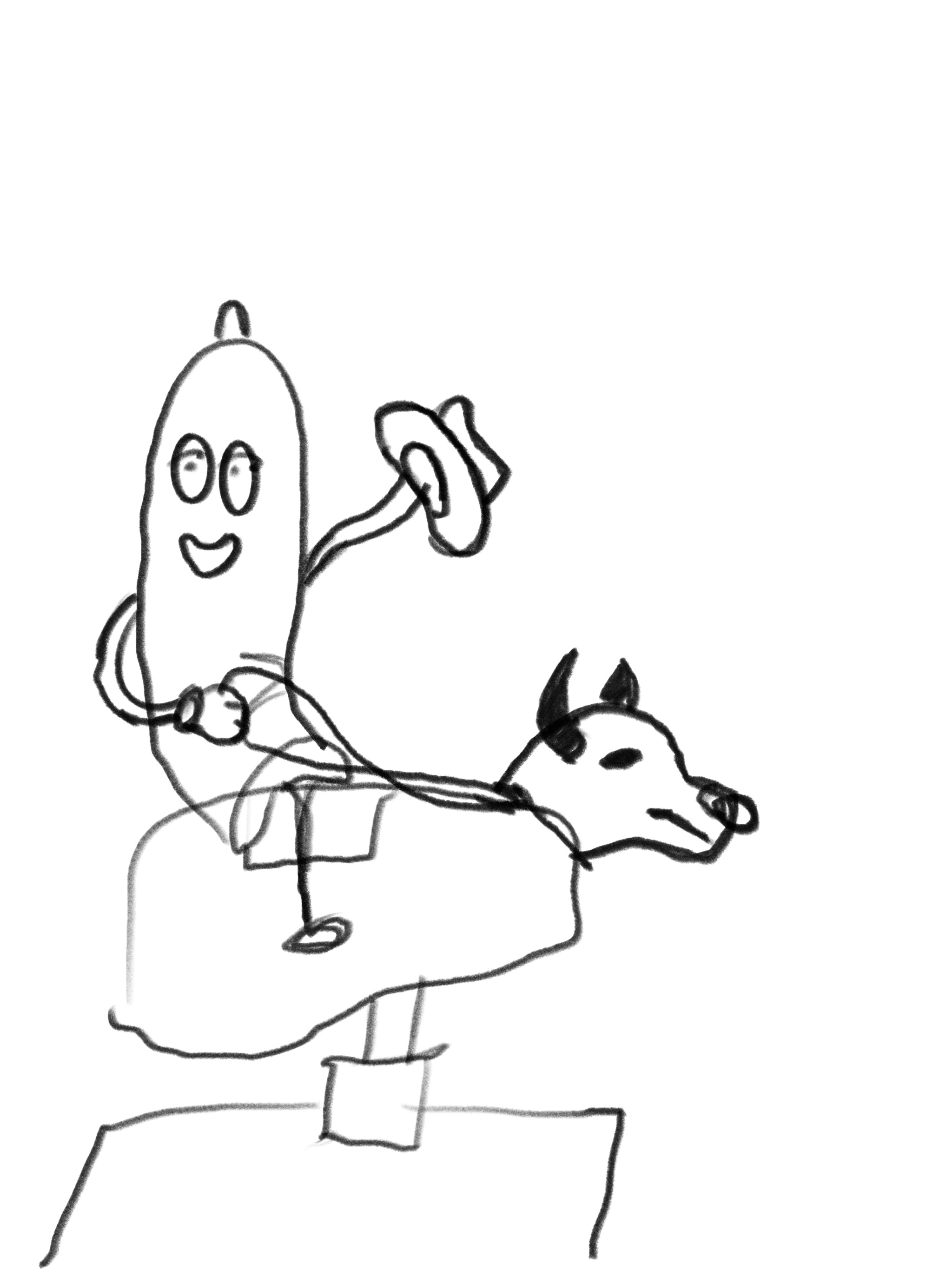
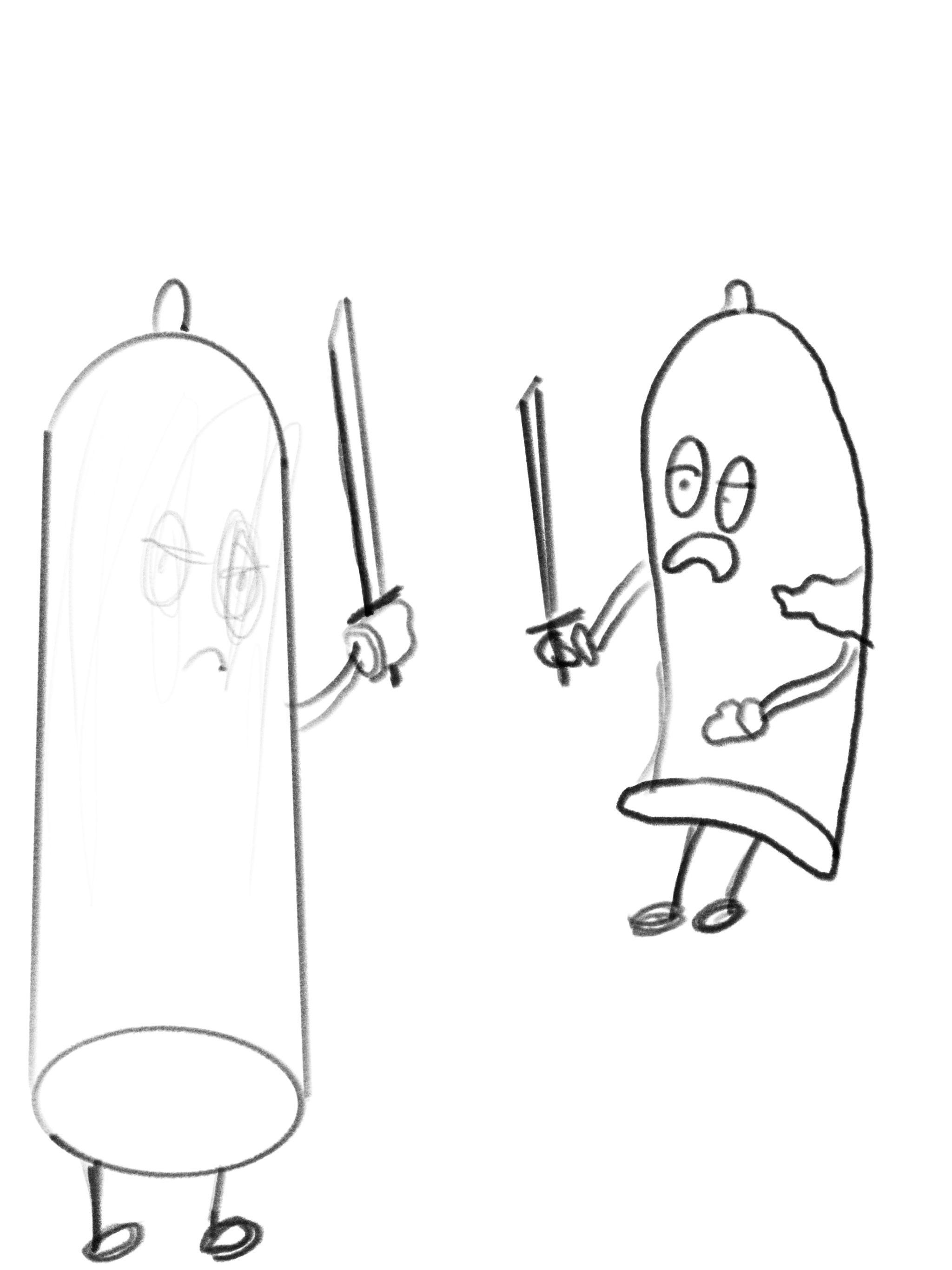
During concept development, a wide range of scenarios was explored to determine which themes best connected with this audience. Early ideas included shopping around, race car driving, holiday gift wrapping, movie theater climax moments, breaking myths rather than condoms, and several other humorous or symbolic situations. Through this exploration, the strongest concepts became drive-thru cravings, bull riding, and sword fighting. These scenarios offered subtle innuendos, immediate recognizability, and a clear opportunity for comedic interpretation while still reinforcing the importance of preparation and safe decision making.
Sketches
Challenges
Character Style
Creating a character that felt friendly, inviting, and humorous was a significant challenge. Early attempts in digital, 3D inspired, and clean vector styles often came across as too stiff or unintentionally unsettling. After exploring multiple approaches, the hand drawn cartoon style proved to be the most effective because it conveyed warmth, personality, and approachability, which supported the lighthearted tone of the campaign.
Color Matching
Another challenge was selecting colors that fit naturally with each scenario. Every scene required its own atmosphere, from the drive thru to the bull riding arena, and choosing palettes that were bold, readable, and visually cohesive took several iterations. The colors needed to support the visual metaphor without overwhelming the characters or distracting from the message.
Typeface Selection
Finding a typeface that was both clean and informative also required careful consideration. The typography had to be easy to read at a glance, complement the playful illustration style, and maintain consistency across all three posters. Testing multiple typefaces helped narrow down a choice that balanced clarity with personality, ensuring the messaging stayed strong and accessible.
Final Posters
